Over the later half of the 20th century, the quality of both still and moving image improved dramatically, which resulted in numerous remakes of popular films. The horror genre in particular has seen many remakes since the mid 2000's, with the originals simply not meeting the standards set by modern horror. When comparing the storylines, special effects, and general shock value of older films such as 'Friday the 13th' (1980) or 'The Exorcist' (1973), to more recent films such as the Saw franchise (2003- ) or Orphan (2009), there is a clear difference in the level of 'horror'.
This has lead to many popular, beloved, or 'cult classic' films to be remade and updated, bringing them to a new, younger audience and allowing the legacy to be carried on to another generation.
One such film is Tobe Hooper's 1982 film, Poltergeist [IMDb], which was remade in 2015 and directed by Gil Kenan (IMDb). With the 1982 American release, there came a poster featuring an iconic image; the child star of the film, Carol Ann, with her hands against a television set, the screen full of static. The 2015 release had three distinctly different posters, with two paying clear homage to the original film and poster design.

The original poster features an artistic rendition of the infamous “They're here” scene from the film, along with the quote itself. The artwork used on the poster was a realism painting by airbrush artist Carl Ramsey, who is also the artist behind the posters for Beetlejuice (1988), and Return of the Living Dead (1985) [Gallimore, 2016]. Before 1990 Photoshop was not an option when it came to graphic design, leaving designers and artists to create the necessary images by hand or through photography. For posters with collage-like layouts or impossible scenes (for example; Star Wars (1977) and Jaws (1975)), photo-realistic artwork would be produced.
The high contrast and monochromatic palette certainly make this a striking image, with a simple layout, quote, and the films title written in a bold and readable typeface. It is attention grabbing and the text makes it memorable and quotable, even before viewing the film. The phrasing of the tag line, “They're here” also plays the 'Pronoun Game' [TV Tropes, 2016], enticing viewers – or prospective viewers – to watch the film and find out who 'they' are.In 2015, the world was given its first look at the remake of 'one of the best horror films ever made' [Hall, 2015], and it was immediately clear that Kenan was sticking close to the visuals created in the 1982 original film, and its promotional material.
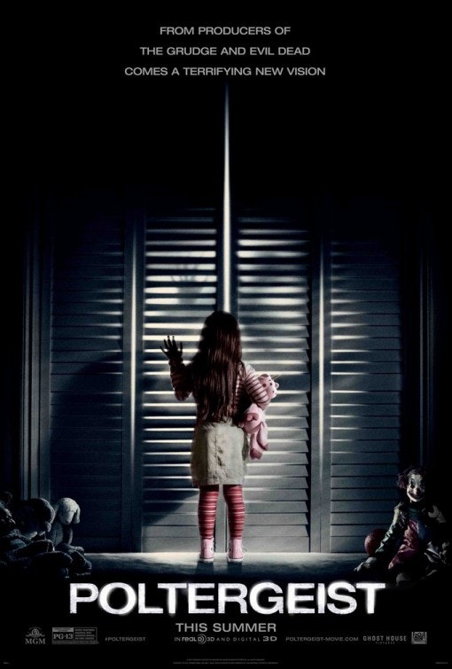
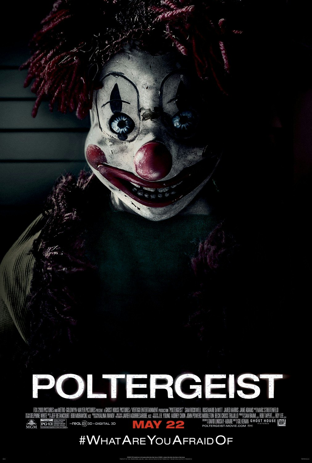
This poster for the 2015 remake serves as an homage to the original, a nostalgia trip for the die-hard fans, and a modern update of the 1982 iconic image. Again taking from a key scene in the film, the photograph has the film's child lead, Maddie, stood in front of a set of closet doors, one hand raised to light coming through the slats, a teddy bear tucked under her right arm with other toys around her – including a rather conspicuous clown doll.
This poster, by itself, does its job well; it portrays an artistic representation of a key scene, it alludes to a key plot point, or threat, with the sneaky but clear inclusion of the clown doll, and the overall blue-ish shadow around the girl, who is dressed in shades of pink, gives the idea of a surrounding sinister presence.
Looking at these two posters side by side, it's clear to see the difference in style and age, simply by the production technique.
The obvious difference is the use of illustration versus photography and digital editing. In the 70s and 80s, film posters were more or less the key piece of promotional material, and without digital screens to display them, they had to be easily printed and distributed. These two decades also showed a preference for cool tones colour palettes and light symbolism [Moore, 2017]. Reproducibility and light symbolism likely played into the design of the 1982 poster, needing to have a colour palette and design that wasn't too expensive or intricate in order to print easily and quickly.An iconic image needed to be created to solidify the film in people's minds, too; unlike now, advertising wasn't an ever-present entity in our lives, popping up on our televisions, buses, phones, social media, sidebars on websites, and even whilst trying to watch trailers for other films. The age of technology has changed advertising, meaning that just the title of a film can be imprinted into our minds by repetition alone. Iconography is what makes a cult classic [Errington, 2015], especially in the horror genre; Jason's mask, Billy the puppet, Pennywise's red balloon. For Poltergeist, it's the little girl with her hands pressed against a TV screen full of static; a visual which comes straight from the original poster.
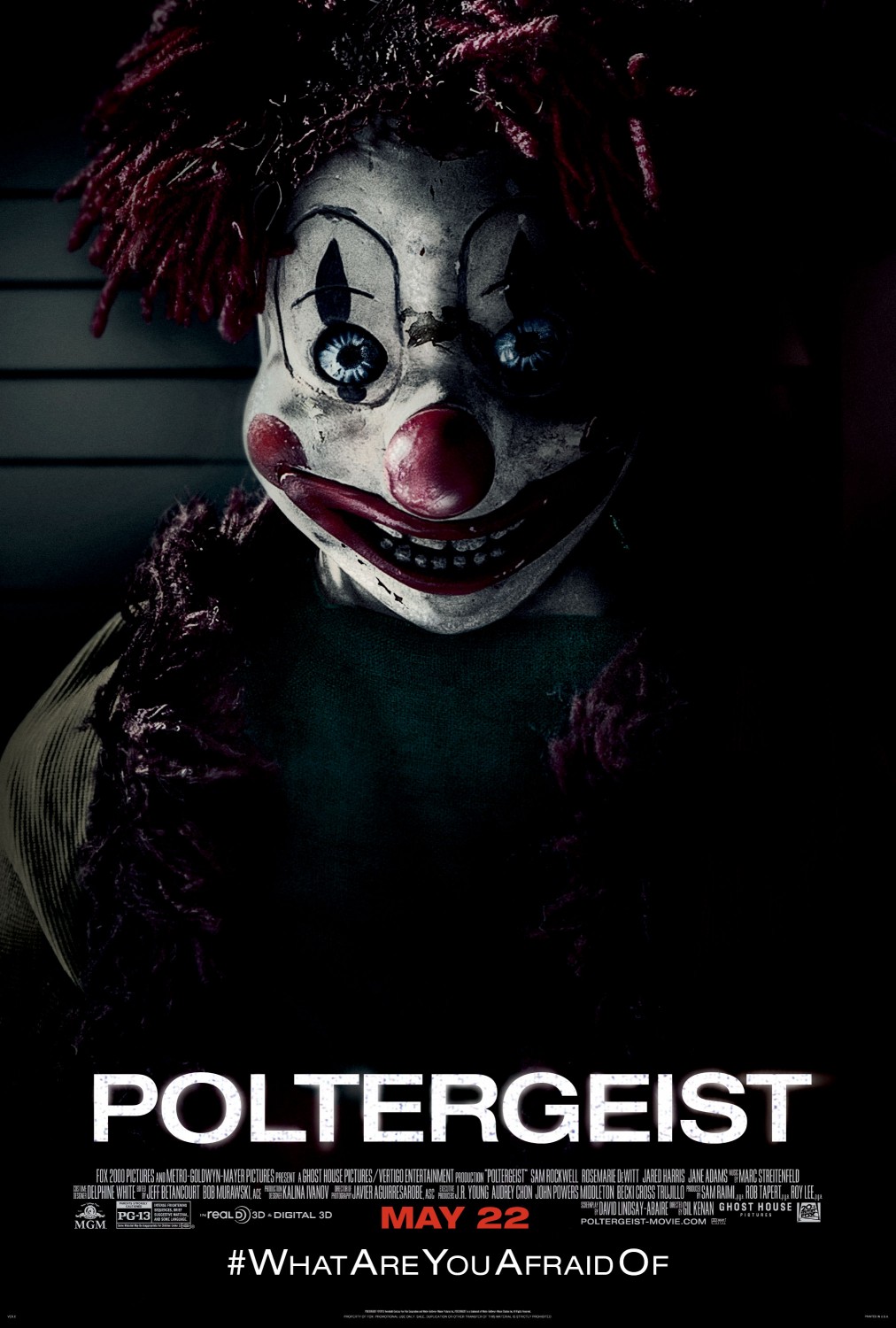
One element of the 2015 poster that is an attempt to create its own iconic image, mascot, or token, is the conspicuous clown doll in the lower right of the poster, carefully added to the collection of children's toys on the floor, blending into the darkness. It would be easy to dismiss if it weren't for the fact it’s directly facing the camera. While there was a possessed clown doll in the 1982 film, the 2015 remake came from a 'post-Annabelle world' [Bishop, 2015] and more emphasis and attention was placed on the token creepy doll antagonist, with another promotional poster dedicated entirely to the doll.
The poster for the 2015 remake is a relatively true to source modernisation of the original poster – the key word being 'modernisation'. Simply the fact that it's a digitally edited photo rather than a hyper-realistic illustration gives it a new, 'clean' feeling, as well as the fact that the poster is in full colour, despite them being fairly muted colours.
The layout, with the young girl (Maddie) dressed in pink in the centre of the image, draws the eye inwards at first, making the child seem smaller, then upwards to the white closet doors, dwarfing the girl and alluding to the 'poltergeist' behind the slats. The darkness around the end of the image frames the girl and the unknown entity in an isolating way, drawing the eye in and creating a sense of entrapment with no escape. Generally, it's a more creepy image, whereas the original poster is more mysterious, especially with the slight blue tint.
The 'fear factor' is more prevalent in this poster than its predecessor, which was 'just terrifying enough' [Hall, 2015] with its PG rating (which may actually have been too lenient for the motion picture) [Miyamoto, 2013]. By upping the creepy factor of the poster, the remake is almost trying to win over the hearts of die-hard Poltergeist fans, as well as horror fans in general.
The horror genre of cinema is one of exploration; politics, religion, science fiction, urban legend and folklore have all been the basis of horror at some point or another – The Purge, The Omen, Frankenstein, Candyman, Sleepy Hollow – but once a story has been done, there is pressure on the next film in each subgenre to outdo the last. It's a genre that is ever-expanding, pushing the boundaries of decency, fear, and shock value as it goes.In a genre that is always pushing its own limits, it may be hard for a writer, director, or producer to know how far to take things and keep the audience satisfied, when there may be two or three films coming out in the time it takes to film and edit a film together that leave their own special effects and scares in the dust. Shock can become familiar. Shock can wear off [Sontag, 2003], and so the only way to be a successful horror film is to do something that hasn't been seen before – which is especially hard when the film in question is a remake of a thirty three year old cult classic.
Arguably, a remake needs to hit two points to find success; it needs to live up to the legacy of its predecessor, and live up to the expectations of modern horror audiences. If the latter is in question, then there cannot be any doubt over the former.In creating the promotional material, they must reassure new and old audiences that the reboot will be a true to source modern remake and not simply an adaptation.While side-by-side comparison highlights the glaring differences in style, production technique, and age, it also highlights the subtle similarities and clever tributes to the original.While the 1982 poster does not depict a scene taken frame-for-frame from the film, it does in essence represent it, with a direct quote from the script; the 2015 poster, however, is a direct reference to a key plot point in both films – the location of the inter-dimensional portal in the child's closet [IMDb].Another clever detail is the teddy bear tucked under Maddie's arm in the 2015 poster; this is a reference to the teddy bear on the floor to Carol Anne's right in the 1982 poster – a small touch but ultimately a detail that brings the images and the homage together, connecting the original and reboot in one image.
In conclusion, visual communication in film advertising – especially in the horror genre – has a unique balance of pros and cons. Even without taking into account the need to be practically one step ahead of special effects and the latest shock tactics, the posters alone have to create excitement as well as fear, even more so with remakes. Reboots of horror films will almost always have a legacy to live up to, while simultaneously updating the storyline and effects within the movie, and finding and preserving the charm of the original that made it so popular. It is a fine balance and, from looking at both the changes and the similarities between the poster for Poltergeist (1982) and Poltergeist (2015) it is arguable that the charm was captured recreated well, as was the 'creepy' factor that is so key to drawing in new audiences.
Both posters could be considered 'iconic' or at least notable for different reasons; the 1982 poster is iconic for its association with the birth of a cult classic, having earned its place in cinematic history; the 2015 poster is notable and instantly recognisable (thanks in part to the original), and will forever by synonymous with bringing a much loved supernatural classic to the modern era and a new generation of horror fans.
As with any visual communication, an unavoidable influence in the change of poster production is the evolution and constant update of digital technology, but a unique factor in this case is that of the horror genre as a whole, and the never ending need to reinvent itself in new shocking ways, and fight the threat of desensitisation for the sake of entertainment.
Bibliography
TextIMDB, (C. 1990-2018). Poltergeist (1982). [online] Available at: https://www.imdb.com/title/tt0... [Accessed 30 April 2018]
IMDB, (C. 1990-2018). Poltergeist (2015). [online] Available at: https://www.imdb.com/title/tt1... [Accessed 30 April 2018].
Gallimore, J (2016). Artist Behind The Image: Carl Ramsey. [online] Camera Viscera. Available at: https://cameraviscera.com/2016... [Accessed 30 April, 2018].
TV Tropes, (2016). The Pronoun Game – TV Tropes. [online] Available at: http://tvtropes.org/pmwiki/dis... [Accessed 30 April, 2018]
Hall, J, (2015). ‘Poltergeist’ First Look: They're Heeere…(And They Look Awfully Familiar). [online] ScreenCrush. Available at: http://screencrush.com/polterg... [Accessed on 30 April 2018]
Moore, K, (2017). 24 All-Time Best Movie Posters with Greatest Designs. [online] Company Folders. Available at: https://www.companyfolders.com... [Accessed on 30 April 2018]
Errington, R (2015). The History of Film Posters. [online] The Artifice. Available at: https://the-artifice.com/the-h... [Accessed on 31 April 2018]
Bishop, B. (2015) The Poltergeist remake trailer reminds you why clowns are the worst. [online] Available at: https://www.theverge.com/2015/... [Accessed April 31, 2018]
Miymoto, K (2013) Why Was Poltergeist rated PG? [online] Quora. Available at: https://www.quora.com/Why-was-... [accessed April 31 2018]
Sontag, S. (2003). Regarding the Pain of Others. New York : Farrar, Straus and Giroux, p73.
Images[1] – Cryptic Rock. (2017). Poltergeist poster 1982. [Image] Available at: https://crypticrock.com/polter... [Accessed 27 April 2018].
[2] – USA Today (2015) Madison Bowen (Kennedi Clements) discovers apparitions that have invaded her family’s home in a scene from 'Poltergeist.' Available at: https://www.usatoday.com/story... [Accessed 29 April 2018]
[3] – IMP Awards. (2015). Poltergeist Movie Poster (#1 of 3). Available at: http://www.impawards.com/2015/...
[4] – IMP Awards. (2015). Poltergeist Movie Poster (#2 of 3). Availbale at: